
As suggested by my tutor I stepped up the paper size and chose chunky materials to draw. In my stash I found water soluble crayons, oil pastels, acrylic paint, conté, coal and soft pastel sticks, watercolours, acrylic markers and promarkers plus A2 drawing paper, coloured drawing paper and large newspapers.
With the first one I tried to achieve dynamic marks, using a broken piece of crayon on its side.

Apart from the beetroot I am quite happy with the result. But my crayon box contains coloured sticks, too. So I tried that, rather timidly.

I then tried to add water to it, but it turned out I had used too much crayon for that. Everything went black.
How would water(colour) work on oil pastels?

Still a lot of black, especially in the pepper. Also the marks in the pepper make it look as if it were creased paper and the back of it jumps forward. But I like the way the oil pastel repels the water and so restricts colour to spaces between marks. I had used the groves technique on the beetroot again. The watercolour would enter into them making them red instead of white. I like that.
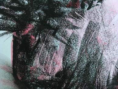
I had tried to be more gestural with the application of colour and paint outside the lines. No success there. The cast shadows are smudged oil pastel. I found that the depth illusion is stronger if I smudge in the direction of the ground (horizontally) not in the direction of the light (dioganally). I used the side of my hand for rubbing. Flakes of pastel drew nice lines in the smudged areas. I like the cast shadows.
Now that I had begun using colour I moved to acrylic paint.
To begin with I used the acrylic to make a white ground on the newspaper to draw on with oil pastels. I then tried shadowing with ink which did not work at all. The ink is not repelled in the same way as watercolour and just makes rather ugly and dirty areas. What I liked discovering was how the crayons work out the pallet knife marks in the acrylics beneath. I also like the rough edges of the white background, leaving not an edge but an area for the picture to run out.
So what if I use acrylics for the coloured bits, too?

I decided to draw the lit parts of the objects this time to see how that would work. My markers were not so opaque as I had thought so I first painted a white ground for the coloured parts. I used a rectangular pallet knife which made very distinct marks. I then coloured the white. The shapes were very hard to recognise so I added some lines to the mushrooms to suggest their form. It does not really work. Especially the beet root is all wrong as I also drew in the shadow. The mushrooms in the foreground are fine I think. If I had arranged and lit the objects in a manner so that lit areas define dark ones like in the middle mushroom’s foot it might become very nice.
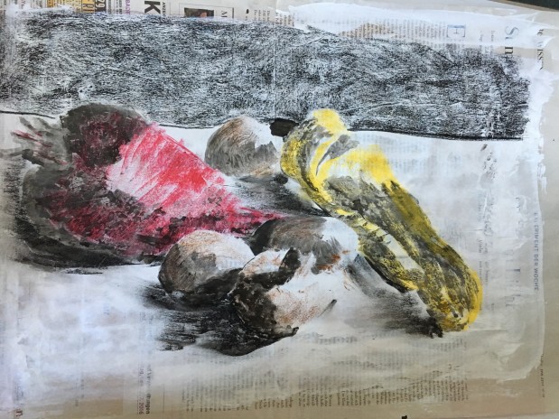
Even if I consider these last two experiments failed I like the colours. So the next and final experiment I started with the colour. I used a pallet knife and had only roughly sketched in the position of the veggies in order to not being able to stay inside the lines. I then drew in the heavy lines with a felt tip pen.

To add shadows for depth I used conté sticks in dark grey and black. I used them for the cast shadows, too, but they became very much too heavy. So I tried to get rid of them and use smudged oil pastels instead. I decided to add a bit of blue into those and also very sparingly in the shaded areas of the veggies. I like the effect very much.

Acrylics, felt tip pen, conté sticks, oil pastels on wall paper
Conté for the cast shadows was a mistake and it mars the picture. Apart from that I am really pleased. I think this is the best of all the pieces I have done for this exercise, including the graphite ones.
Reflections
I am very glad I used larger paper and different drawing media. It really opened me up to new ideas. Changing paper and media kept the ideas coming so that each drawing jogged new ones. I tried to listen to my own reactions and curiosity and to act upon them.
I have kept to my still life throughout these experiments in order to concentrate on finding new ways without the need to get to know new shapes. I am quite tired of it now.
Looking back I realise that for the final picture I have used things I liked from most of my experiments and sketches and collected them in one drawing. This drawing would not have been possible without all the studies that went before. So even if most of the experimental drawings are failures, they were necessary for the process. It is one thing to be told this, and quite an other to experience it.
Add on
Is a still life a still life if it is not situated in an environment? Only one of the above pictures give any clue as to where the veggies are. I wanted to see what would happen if I add a dark background to the last of the still lives to suggest a table. So I made two more of them. I found it difficult to duplicate the picture. The new ones lack the immediacy of the original. This is something I experience often, not being able to achieve a certain effect again. The following two pictures have aspects that are better than the original and others that do not work as well.
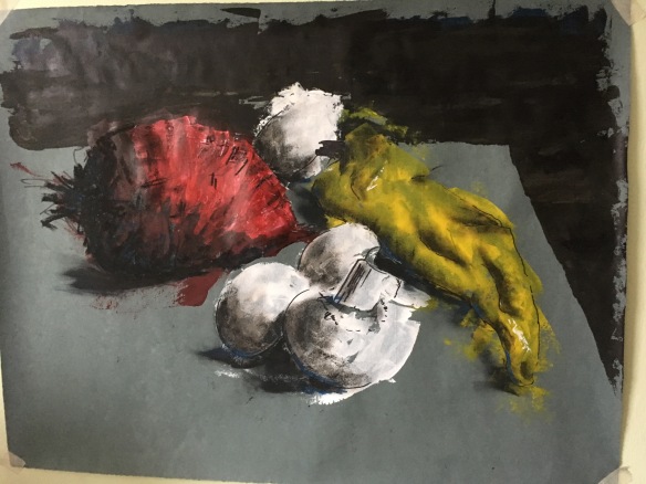
The background hightens the sense of depth I think. And the mushroom in the foreground is very nice. However, the dark paper changes the hue of the paints. For the pepper this works well, as the dark in the thinner layers suggests a shadowing. The beetroot on the other hand turned out too dark and muddy so I decided to give it a layer of white first. Applying it I lost track of the shape so that turned out all wrong. Also the blue paper does not add any interest. The blue in the shadows does not really show in the photo, in reality it is much stronger and bolder than in the original drawing. I like that very much. I also like the shadow beneath the tip of the pepper which makes it arch over the surface.

In this version the paper works better and the beetroot turned out really nice. But I am not satisfied with the mushrooms and did not at all succeed with the pepper.
So even if certain details are better in the two latest versions, all in all I think I still go with the original.

My favourite aspect of the OCA blogs is seeing others’ experiments. Thanks for sharing!
LikeLike
I agree!
LikeLike
I do like where this exercise has taken you. The beetroot in your final piece is my favourite, but I am really inspired by all your experimentation.
LikeLike
Thank you, Carolyn. I do think the main value here was the experimenting itself and what it has done with me.
LikeLiked by 1 person