
- choose several organic objects and arrange them
- concentrate on accuately representing their forms, considering light, shadows, ground and spaces between objects
- Draw boldly, larger than life. Don’t be hesitant
- Experiment with the weight of marks
- Reflect: How can you describe the objects’ form through your marks, what is the surface like, how do the objects relate to each other?
Preparatory work
To start this exercise I googled “Still life drawings” to jog some ideas on mark making. I was initially looking for the “weight” of marks and for gestural marks and how they are used. I did not really find what I was looking for but ideas about other aspects of still lives started tumbling in: subject matter, arrangement, drawing surface… One of them was about combining media to achieve certain effects. This is new to me, I tend to restrict myself to one medium and often one way of using it, too. The different media should be contrasting in different ways: hard – soft, sharp – fluid, light – dark, b/w – coloured etc. I put these ideas into a research map which I referred to frequently during the following process.
I then decided on my subjects. I wanted them to have some kind of correlation and I wanted them to be different in their texture. With this last specification I wanted to challenge myself into versatile mark making. I found the following:
- A beetroot: rough texture and uneven shape
- 4 mushrooms: velvety texture and rounded shapes
- A pepper: smooth and shiny texture, interesting bumps and indentations
Initial Sketches
I started in my A4 sketchbook to get to know my objects and test some of my mark making ideas and media mixes:
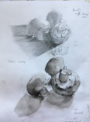
I like the ink with charcoal best as it renders the velvety texture of the mushrooms very well. I managed to place the different tones of the ink washes right so they reflect the actual shadows. With the charcoal I added detail and strengthened some contours.
The hatching is nice, but does not really fit the texture here.
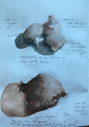
I found the cold colour of the graphite did not combine well with the warmth of the sepia ink. However, the colder black shadows work well.
Beetroot: Very nice ink marks in the right spots where the root has blemishes. The chalk pen was moody – sometimes it would make nice strong marks, sometimes none at all. And the tip broke all the time. When I got so frustrated that I used it with barely any tip at all I found that the wood makes grooves, where the later charcoal smudges would not enter. Very nice effect! I like the rough and dirty texture of this beetroot.
I like this very much. I managed to make the ink shadowing
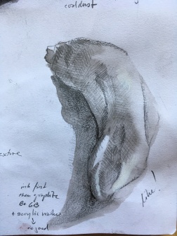
nice and soft without any hard edges. I also left one highlight. The hatching in patches of different direction and intensity gives an illusion of separate tilting planes which describes the shape of the pepper very well. However, I feel it does not describe the smooth and shiny texture. I tried to add highlights I had accidentally painted over with white acrylic marker. That did not work at all.
The charcoal on top of the cast shadow works well to show a smoothish non reflective surface (tabletop).
I then combined them into a first still life.
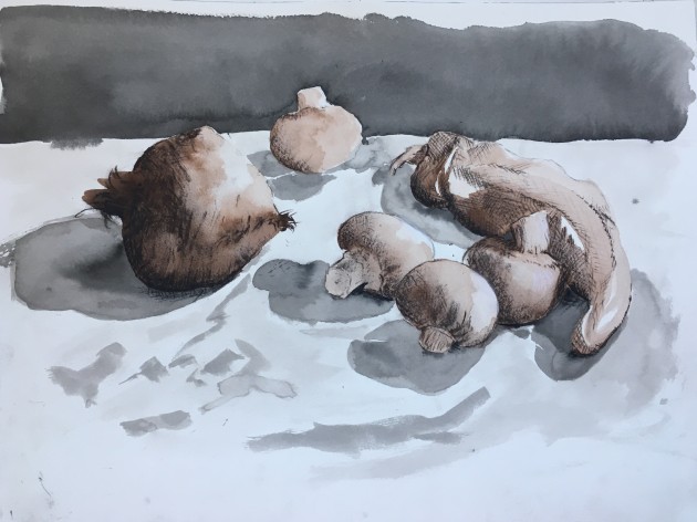
I think this has a nice depth. I made the contours in the mushrooms and the pepper tip in the foreground stronger, in the background I did not add any contour lines and tried to be lighter with the shadows to give a sense of depth. I think also that the dark strip behind the table strengthens the illusion of space. Maybe even the arrangement of the veggies, especially the pepper.
Again I like the beetroot in its knobbliness and roughness.
The ink works well, as it reflects shadows and lights.
I did go for the hatching in the pepper and felt that for reasons of cohesion I have to use the same technique in other parts of the picture, so the mushrooms got it, too. I am, however, not sure if this is important.
I had put the veggies on a white cloth. I liked the way it messed with the cast shadows. But it does not work like this, I will have to study fabric separately some time.
First Drawing
For this I put the veggies closer together and chose watercolour paper for the ink to behave better. Also I skipped the cloth. As I wanted to use graphite I chose the black ink. I did not change the water, though, hence the warm tinge to the lighter areas.
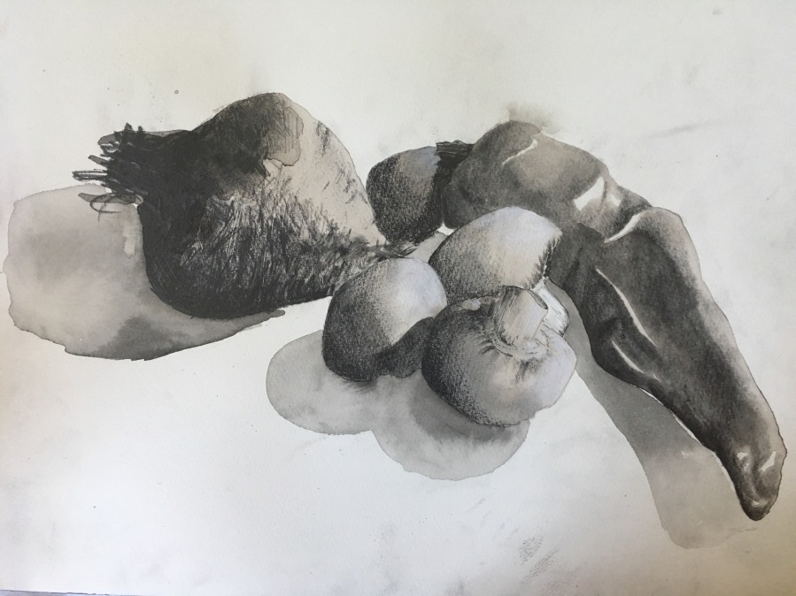
In this I was less successful with the ink, so the lit parts are much less prominent. I tried to remedy that in the mushrooms with a white chalk pen.
In the beetroot I overdid the pencil marks which caused it to lose shape and interest. However, the grooves (done with the metal tip of a pen eraser) work well.
The mushrooms turned out very nice, I think. For their shadow side I used the pencil on its side, trying to give no direction to the marks. The watercolour paper’s tooth thwarted that somewhat, but not too much, I think.
For the pepper I tried a paper stomp and graphite shavings. I do not do that usually, but I think it works better than the hatching for the pepper’s texture.
Apart from the beetroot which is quite flat there is some sense of depth. It is less than in the sketch above but then the veggies occupy a smaller space. Maybe I should have left the lone mushroom where it was.
Reflections
I felt the step to A3 changed a lot. The nice expressive marks from the sketchbook did not work as well as they are much thinner in relation to the size of the objects. Maybe this is why I overdid the marks in the beetroot. I felt that I have to find other marks and media for this size.
During all of these – sketches and drawing – I tried to be more adventurous in my mark making and get away from the pencil. It proved to be difficult. Maybe it is the wording in the exercise description where it says “accurate depiction” that held me to the pencils. I am very glad I had the beetroot! When I realized this, I decided to go bigger still and have a rummage in my art supplies. But that is a different story.

Love the lights on that pepper..
LikeLiked by 1 person
Me too 🙂
LikeLike
The beetroots are amazing!
LikeLike
Thank you! 🙂
LikeLike